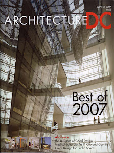
 Not long ago, every building along the streets of downtown DC was a large, looming, ambiguous and concrete clad bunker. This typology was utilized to maximize rentable space, lessen construction cost, and for its quick construction timeline. DC's building height restriction forces many of these buildings to balloon every inch of their rentable space to the perimeters. The lack of any intelligent design among these building blocks almost destroyed any sense of place along the downtown streets. Fortunately, a handful of Washington developers have been listening to the needs of the people who inhabit these dreadful buildings along with the architects. Buildings that add interest to the street and create a "place", buildings that allow for a uniqueness to each space, bring in large amounts of daylight, and can give the owner and inhabitants a sense of "pride", will make up for any amount of rent lost to loosing a bit of square footage. One excellent example of how this can be achieved, regarding how a building can be designed in this manner, is the Newseum, by Polshek Partnership Architects of New York. Instead of monotonous prefabricated concrete panels and small windows, the building utilizes a series of layers and translucent skins. The massive limestone panel along the front elevation seems to float in front of the actual building. This heaviness to the facade is countered by creating a void space directly adjacent. Large amounts of glass are broken up into changing divisions and delicate translucent brie soleil are added to create surface texture and shadow. The interplay of massing, varying transparencies of the layers, and the different curtain wall divisions make the architecture stand out, while at the same time integrating it well into the surrounding context. This building fits very well into the more formally composed DC street fabric, but it definitely does not blend in with the rest. This is a fantastic approach to how modern design should be done in the District.

Read more!
Friday, November 30, 2007
Smart Modernism Downtown
New(s)! Hotel Washington to become W Hotel
 The Hotel Washington, located at 15th & Pennsylvania, NW, will soon close it's doors. But this is (at least in our view) good news, as the stately hotel will be renovated and reopened as WDC's first W Hotel. The news was reported this morning. The 90 year old hotel, built in the Italian Renaissance Revival style, is slated to close on January 1, 2008, and reopen sometime in 2009. The news brings with it the anticipation of a contextually modern renovation of the interior spaces, combining W's sleek, modern aesthetic and chic room decor with the building's classical beauty to create an energetic counterpoint. Of course we'll have to wait to see the final product. (As the hotel's current website illustrates, the interiors are in much need of an update!) In the interim this announcement is yet another sign of DC's emerging appeal as a cosmopolitan destination city.
Read more!
Thursday, November 15, 2007
Modernism In Your Neighborhood
 Modern residential architecture is appearing around just about every street corner in DC, except for maybe Georgetown. That is a whole other monster that will in due time get it's 15 minutes of critique. I applaud the architects of, and especially those who inhabit, modern buildings in Washington. In a city with rigid and often ridiculous hysterical (historic) preservation boards, it is prohibitively difficult to have an opportunity to allow modern design from today's society to make it's mark on the urban fabric. The area North of U Street and between 13th and 9th Streets NW, seems to be a melting pot of modernism. This neighborhood had mostly existed of run down Victorian tenement townhouses, empty lots and some relics of light industries that long ago closed shop. Within the last five years the empty lots have been built upon, the existing townhouses have been cleaned up, and the industrial buildings have been made into loft-esque spaces. For better or for worse, most of the new construction is in the modern vernacular. They have brought on mixed opinions, and have escaped the incriminating opinions of any historic board due to their location outside of the historic districts. They all have given modern residential architecture incorporated into an existing historic context more visibility, but at the same time have proved that not all modern architecture is good architecture. Three projects in this neighborhood were randomly selected.


Read more!
Wednesday, November 7, 2007
MODERN KICKS
Urban grit mixed with sleek modernism is a favorite. Take the shell of a turn of the century commercial space, strip the interior to the raw structure, leave all of it exposed, and add glossy high end luxury pieces of modern furniture to the scene and you get a very chic urban space. Palace 5ive gives street culture some serious attention. Whether you are a seasoned skater or an edgy fashionista, this storefront shop will provide for your urban wardrobe and gear needs. Exposed brick walls, concrete floors, and rough open joists combined with modern furniture donning high gloss laminates and fluid designs creates an energized high / low contrast. This is just the platform created for showcasing the goods. Skateboards and full wall graffiti are the high art on display. Urban gear from the latest sneaks to uniforms for the street are at their best. This is a Palace where anyone part of the urban street culture will feel like royalty.

Read more!
Monday, November 5, 2007
In: Float Glass is the new Stainless
Not long ago, if you wanted to keep up with the Jones' in the kitchen the choice for appliance finish was simple: Stainless Steel. And the market reacted accordingly, with a strong presence of stainless steel and stainless-like finishes. Likewise, developers in the housing market considered stainless appliances the gold standard in amenities, when combined with stained cabinets and granite countertops. But stainless appliances may just have a new contender: Float Glass. 

urban kitchen as well!
Read more!
Friday, November 2, 2007
RETRO URBAN CHIC


Not always does a great venue need signage to catch your attention on the street. Sometimes hints of great design and refined taste will pop out from the chaos of the gritty urban streetscape and become its own form of signage. A new Belgian inspired brasserie, Marvin, does just this act of incognito for the cognoscenti. Just north of U Street, on 14th, it situates itself in a restored simplified Victorian building. Attention getting refined taste is in the clean lines, classic light fixtures, and a storefront that beckons to the window shopper to peer into what appears to be a chic underground salon, marked only by a nondescript logo on the front door. Inside, a relaxed atmosphere charged with a serious chicness is inhabited by a diverse and refined crowd of urban dwellers. Classics given new life create the interior vibe. Simple but elegantly rich marbles, tiles, punched tin and dark woods with plenty of mirrors (to see and be seen) dominate. Move upstairs to the lounge, and marble topped cafe tables tightly fit with banquettes in modernized damask prints allow for a cozy and social experience. Outside on the roof deck bar/lounge vintage light fixtures and Victorian mantelpieces give the bar the same modern interpretation of vintage pieces that is the recurring theme throughout. The entire experience of excellent food, great scenery, a funky urban mood and chic design place Marvin on the *IT* list for anyone in-the-know.

Read more!


