Sunday, June 29, 2008

H is for Housewares!


For those of us urbanites involved in the constant hunt for modern, handcrafted, chic, and useful elements to furnish our homes with, I have recently discovered a new boutique that is a must see. Nestled inside a new storefront on the bustling 14th Street NW corridor, Timothy Paul Bedding + Home welcomes the window shopper by allowing them to, for a few moments, peer at the window displays and feel as though they are looking in at a shop in SoHo. The goods are plentiful. Everything from hand crafted beds, tableware, bedding, seating, mirrors, and some of the most incredible glassware that can be found anywhere in the city is bursting with energy inside. Trends and Classics mix well with bright colors, luxurious materials and finely crafted elements. The design of the store itself follows the theme of well crafted design. The wall system is composed of perforated metal shelving anchored to a more organic composite wood that is sleek with a high gloss finish. The metal racks which delicately display the bed linens are also crafted to an organic curve to soften the structured and orderly display. The service desk is a rigid metal frame wrapped in screenwork. The countertop is a study in concrete surface that is somewhat bleached and embedded with glowing light blue shards of recycled glass. The three materials of dark metal, polished concrete and shards of glass all compose a very elegant and functional piece for the store, on casters no less! Do yourself a favor and stop by 1529A 14th Street, NW and indulge in the great eye candy on display and take a step further and indulge in that perfect piece to bring to your own home.


Read more!

Thursday, June 12, 2008

On The Scene : Mitchell Gold + Bob Williams


It has been quite the week for socializing amidst good design. What better way to spend a balmy Wednesday evening than to attend the White Here White Now party at the super chic Mitchell Gold + Bob Williams furniture store on 14th Street in the Logan Circle neighborhood. Upon arrival, you were greeted with a streetside lounge complete with white lounge seating and white carpets. This outdoor room invited the inside guests to mingle with the outside urban energy of the street. Huge storefront windows beckon the passerby to peer inside to the one time auto showroom. Original details still remain with massive limestone clad columns and plaster ceiling designs and become an invigorating setting for the simple and chic furnishings that the store promotes. Inside several hundred urbanites were dressed to the nine in white and more white. A white chocolate martini fountain got the party started while the Legendary Lady Bunny directly from Manhattan spun the tunes behind the dj booth. Rumor had it she arrived by a white helicopter that parked on the rooftop. Gift bags topped off this spectacular event to promote the urban lifestyle and great ways to furnish it.

Read more!

Tuesday, June 10, 2008

On The Scene : G-Star

It is always a treat to go to an opening party for a new store in the city. This is one of the perks you get by living in an urban environment. People watching, socializing, cocktailing, dj spinning, and gift bags all the while being surrounded by great design. The G-Star store on Connecticut Ave. and R Streets that recently opened threw a great party to promote its sleek, modern, and raw Dutch clothing designs. This fashion house bases itself on urban and durable fabrics such as waxed canvas coats and stiff cotton jeans. Military and industrial themes rein in the stylistic content throughout the store. Picture a safari-warzone. This is the general aesthetic. The detailing and design of the store itself echos the inspired clothing line. Waxed canvas drapes and "jump seats" similar to those of the Land Rover Defenders, compose the fitting rooms. Stained steel panels line several accent walls. Fabricated steel racks and displays that are carved into the walls function for the displays. Haphazard lighting hangs from the ceiling and from underneath the metal shelving, creating a sterile and laboratory feel. The store may feel a bit raw, but that is the entire intention. The clothes themselves fit perfectly into the urban warzone where creative denizens enjoy playing the part. Everyone from editors at Washington Life Magazine, Fashonistas, and social scenesters like Svetlana at Brightestyoungthings enjoyed the revelry of the urban event. Great design is always a good way to start a party.


Read more!

Sunday, June 8, 2008

Travel Log : St. Armands Key, Florida

The Sarasota School of Modernism plays a very important role in the significance of mid-century modern architecture. The area of central Florida still has many relics from this period. Drive-in motels with flashy pools and courtyards, automobile dealerships and showrooms, strip-malls (the first ones) and single family residences all themed for the age when people went "motoring" and sat poolside during their three martini lunches, turn up in most of these Floridian towns. Many have fallen into disrepair, but still retain some of that original glamour that they intended to evoke for the modern lifestyles of that age. Sarasota and the key islands that border it are no exception. Many of these mid-century residences are being restored to their original glory. The downtowns with the glitzy display cased storefronts are booming again with pedestrians. While these historic gems are having a revitalization, there is also a growing taste for today's modernist principles in design. New waterfront homes that are designed with the mid-century principles of open floorplans, simple materials, spaces that blur the lines between indoors and outdoors, and modest square footage are becoming more popular. One commercial space along the main drag through St. Armands Key, which is just beyond Sarasota, follows these new Floridian modern principles. Cork is a hot new winebar and lounge. The exterior storefront is a simple palate of glass, steel and stucco. The heavier masonry massing of the elevation gently wraps around the delicate glazing to create overhangs and balconies. The effect is a pulling of the passer-by into the spaces while encouraging the occupants to interact with the street scene. The entrance invites you into a very light-filled space with terrazzo surfaces and plenty of bright tropical colors which punctuate individual walls to create boundaries rather than enclosures to the spaces. The first floor is more of a cafe welcoming visitors in from the Florida heat during the day. Evening hours bring people up to the second level to engage in a more intimate and loungy atmosphere. A central open riser stair, transparent glass rails and countertops flank a orange tiled wall which connects the upper and the lower spaces. The lounge combines rich wood panels, dark leathers and fabrics with more luxe seating banquettes. The lighting here is through a series of clerestory windows and the light filtered through a mobile screen floating in the stairwell. Glass panels create a flow of this space to the exterior balcony space. Here the loungers can interact with the vibrancy of the evening street culture. These spaces combine the public of the street with the intimacy of the lounge as well as the old Florida lifestyle with the new.
Read more!

Thursday, May 15, 2008

HERE AND NOW


Finally DC has caught on to the fact that installation art makes a HUGE scene, and creates a wonderfully intoxicating buzz around it. Transformer Gallery has invited a crew of modern artists and thinkers to take over the raw and vast warehouse space on the corner of 14th and T Streets, NW, and saturate it with art that creates an experience, makes you think, question, and become inspired by something that you never expected. If you have not yet wandered through, you MUST. It is open Wednesday-Saturday 1pm-7pm T Street entrance in the graffiti covered building. It is open until May 24. Pictures of DC as background to several dozen hanging fishbowls invokes the thought that maybe we all live in a fishbowl? The room without walls casts shadows of the ephemeral, follow the path of raked glowing rice though the space where other semi-non-spaces exist. Color, Layer, and mass in several other installations add to the oddness of the former church spaces. The fourth floor penthouse is a fantastic light filled space that glorifies building decomposition, and celebrates it by integrating color, translucency and organic form to the infrastructural weatherings and failures. It is always a trip to venture into an experience that takes your thoughts to another level. Here and Now. Go There and be Wowed.
Read more!

Tuesday, May 13, 2008

Travel Log : San Francisco

...continued from previous two posts. This will be the final post on my adventures and discoveries in San Franciso, California. That trip yielded an abundance of possible blog posts for this site, but I chose the buildings that most inspired me. The integration of historic San Francisco and modern San Franciso side by side and mixed into each neighborhood created the feeling of a very significant history along with a very modern city. The following pictures are just some glimpses of other buildings that caught my eye and added significant modern design to the ever changing cityscape.
Read more!

Thursday, May 8, 2008

Travel Log : San Francisco

...continued from previous post. The Mission District in the city, especially along Valencia Street, is a hip and funky neighborhood just like DC's 14th Street corridor. Vintage shops, cool restaurants, independent designer's storefronts, and some new innovative architecture make this place a must see. The following townhouse is really sleek in it's use of modern materials and how they are implemented to define the varied massing. Commercial and industrial finishes are softened by simple bamboo stalks and a more human scale to the overall composition by the use of plenty of outdoor spaces. Here the old and the new can each stand on their own merit, while giving nods to each other by way of massing and bay structures. This is a great example of how modern architecture next to historic architecture adds interest to the neighborhood, rather than diminishing its significance.
Read more!

Wednesday, May 7, 2008

Travel Log : San Francisco

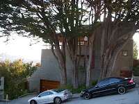
During my week in San Francisco, I was inspired by many modern houses. Many of these were infill buildings built along side of more traditionally historic buildings. The interplay with classic townhouse forms between the old and the new was the connection to the past, while the juxtaposition of the very modern materials against the old gave these places a stunning prominence. The modern houses all had one common element; they were designed to capture the amazing views and to celebrate the landscape. The next few posts will be of a particular building, or a series of buildings in a particular neighborhood. The first is of a house high above the Castro neighborhood.
Read more!

Wednesday, April 30, 2008

Travel Log : Napa County, California

...continued from previous post.... Yet another winery we stumbled upon while driving around the hundreds of wineries and vineyards that dotted the Sonoma Valley and practically flooded Napa Valley was obviously the one that had been designed by Michael Graves, Clos Pegase. I had read about this while doing a pre-trip search for wineries that were architecturally significant and/or modern. I had not intended to stop and photo document this one for it appeared online to be a typical Graves design which incorporated garish color schemes with over sized geometric shapes that allowed for a gimmicky and forced design aesthetic. Regardless of my preconceived critiques, we pulled over and decided to see if the wine was any better than the architecture. Approaching the wine tasting rooms, the landscape was riddled with some of the most world famous modern artist's sculptures. Jean DuBuffet, Richard Serra, and Henry Moore are just some of the artists whose work grace the grounds. The entry to the tasting rooms is somewhat of an abstraction of a Greek temple. Here the architecture becomes believable and well intended. It is all about framing the view and the axis of your procession through the space. Garden courtyards are rigidly groomed in a very architectural manner. Landscape elements, sculpture, and architecture all begin to mix together and play off one another, almost in competition. It can be perceived as a bit busy. The effect of the architecture to create an experience though was quite successful. Once inside, a multitude of modern paintings and sculptures were exhibited throughout the space. If the collection had been edited to a few select pieces, and had the architecture not been in competition with the art itself, the result would have been much more enjoyable. The tables which were piled with the typical wine souvenirs and themed gifts conflicted with the fine art to cheapen the whole setting. What made this winery much different than the previous one I visited was that it was more of an object in a beautiful setting that did not celebrate the natural beauty that it sat in, but tried to take all the attention for itself. This example of bold design displayed how more can be just that, more, and too much more. The wine on the other hand was simple, enjoyable, yet a bit bland and forgetable.
Read more!